Challenge
AstraZeneca entrusted us with the realization of their new headquarters in Italy. The new headquarters, which we developed according to sustainable design and construction principles that promote water and energy conservation, with the goal of obtaining LEED Interior Design + Construction Gold certification, is located in the innovative MIND Village. This area, within MIND, is undergoing the conversion of Expo 2015 buildings based on circular economy principles.
Together with JLL's Tenant Representation and Project & Development Services teams, we completed the renovation of the interior spaces in four months, overseeing the project's development from concept design to preliminary and executive design, coordination of construction activities, and realization of building and system adaptations.
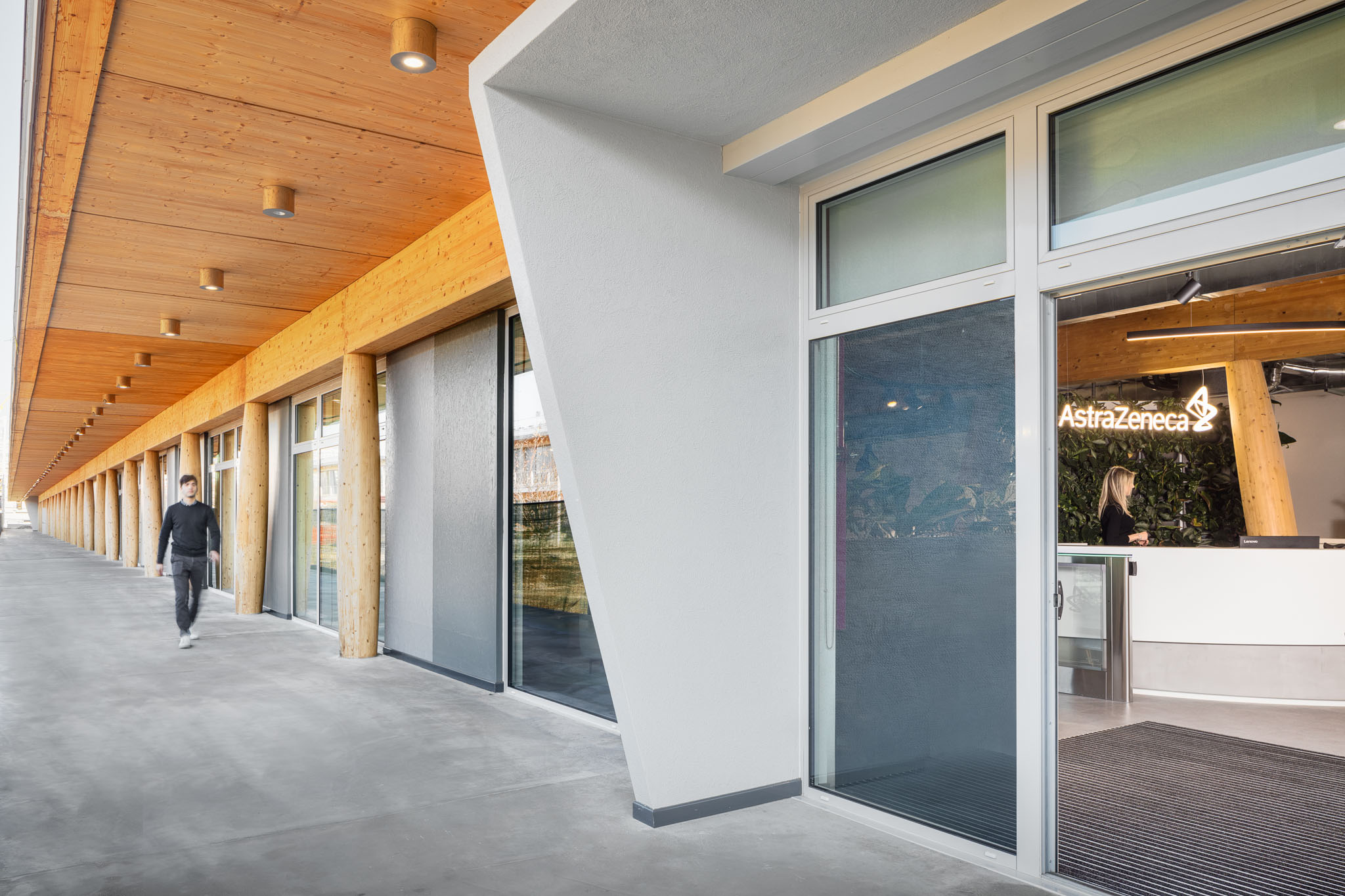
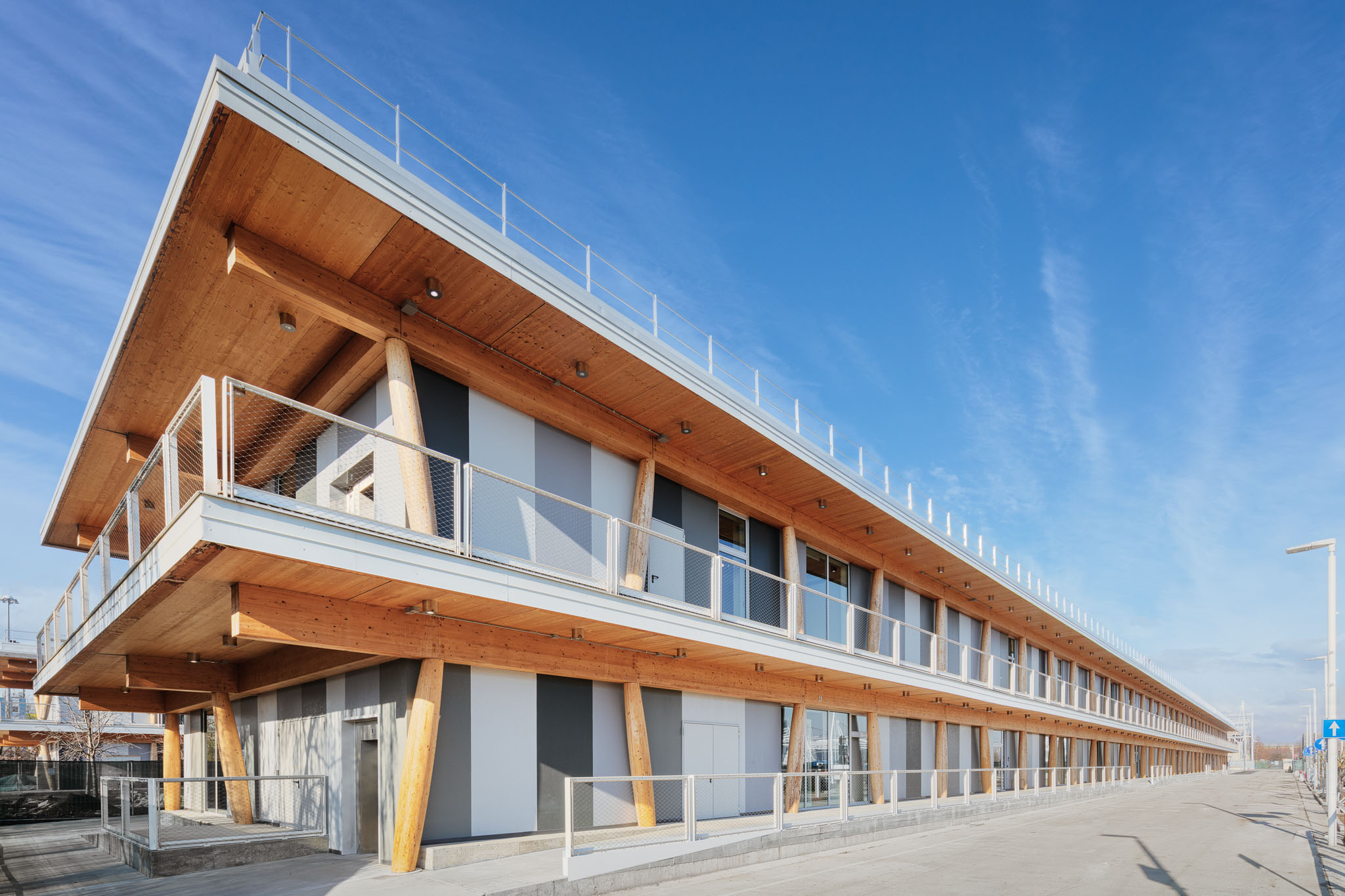
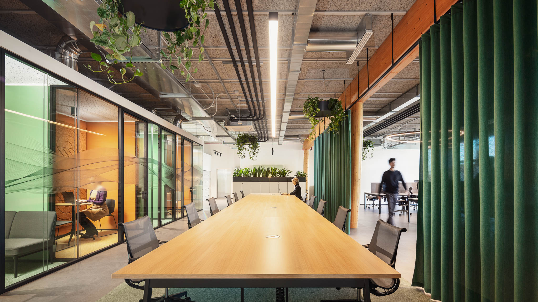
The refurbishment work brought an old Expo 2015 pavilion back to life, preserving and enhancing its internal wooden load-bearing structures, which define the project's DNA and the entire space. The existing envelope, already LEED Gold certified, offers a beautiful space spread over two levels, with a strong connection between internal and external areas. We created approximately 3000 square meters of flexible spaces designed to promote inclusivity and improve the quality of work and life for those who occupy them, placing people at the forefront.
In line with the new function of the office, which is increasingly becoming a destination to facilitate a sense of belonging, creativity, and learning, and to generate meaningful experiences, our goal was to create, through design, not just a simple workplace but an experiential, flexible, and cutting-edge environment from which people could derive maximum well-being and where they would be happy to go to work and interact spontaneously with each other. A vibrant and rejuvenating place that stands out for its abundant use of biophilia, natural materials such as wood, and the introduction of organic and delicate architectural forms and lines into the space, creating a sense of well-being and fluidity to enhance the relationship between humans and nature.
Photo: Davide Galli

Solution
For the project's concept, we were inspired by the constant need for well-being of the human body and mind, expressing the philosophy of "mens sana in corpore sano" through design and creating a connection between humans, their minds, and the space. Taking inspiration from the various emotions that the mind can perceive when moving fluidly through space, we recreated these experiences within the interior by creating multifunctional, varied, and never monotonous work areas characterized by smooth mobility, emphasizing the idea of a connected and vibrant environment. Each area stimulates the five senses differently, incorporating different materials, textures, furnishings, and colors, allowing people to have multiple experiences within a single space.
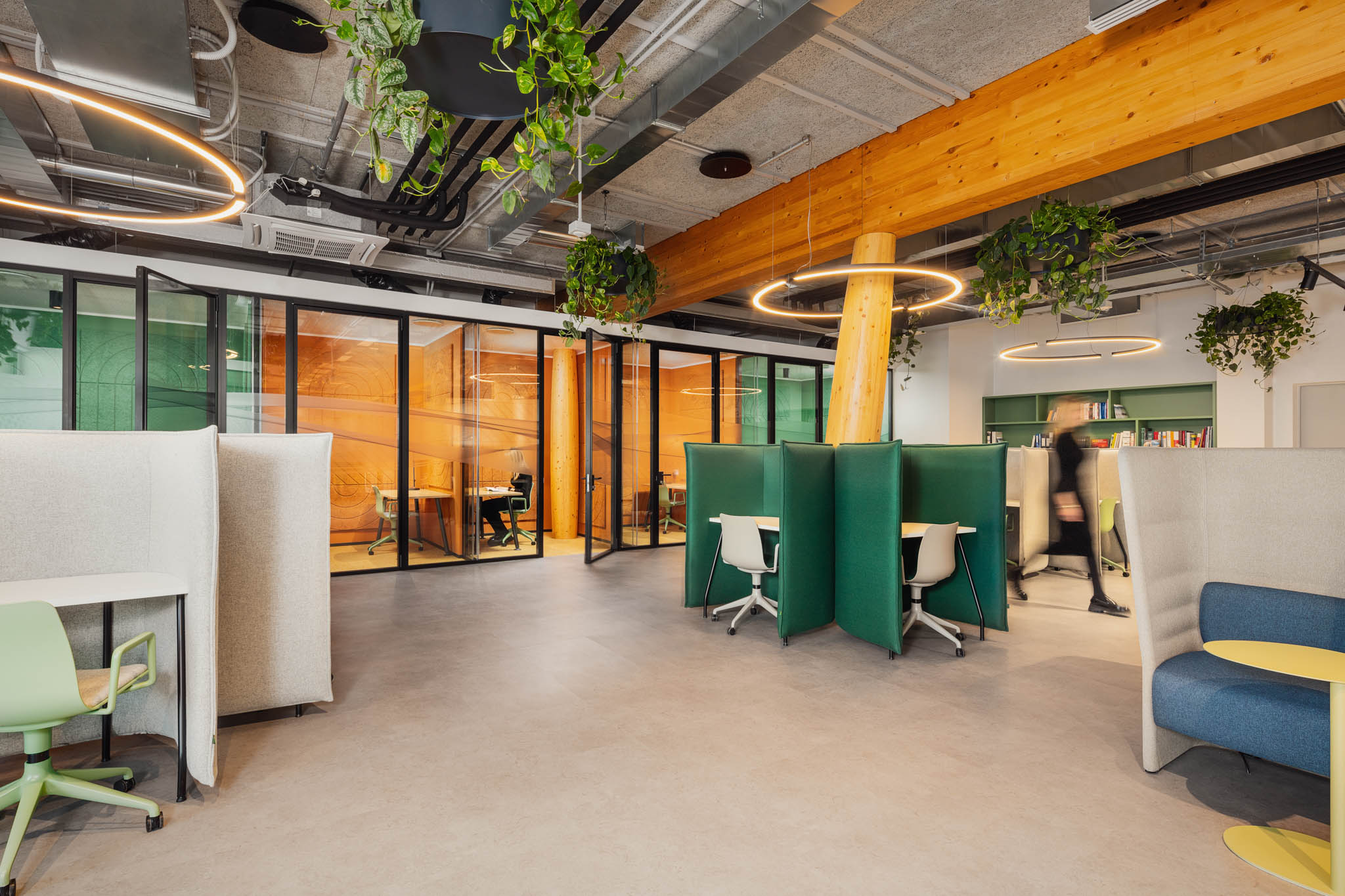
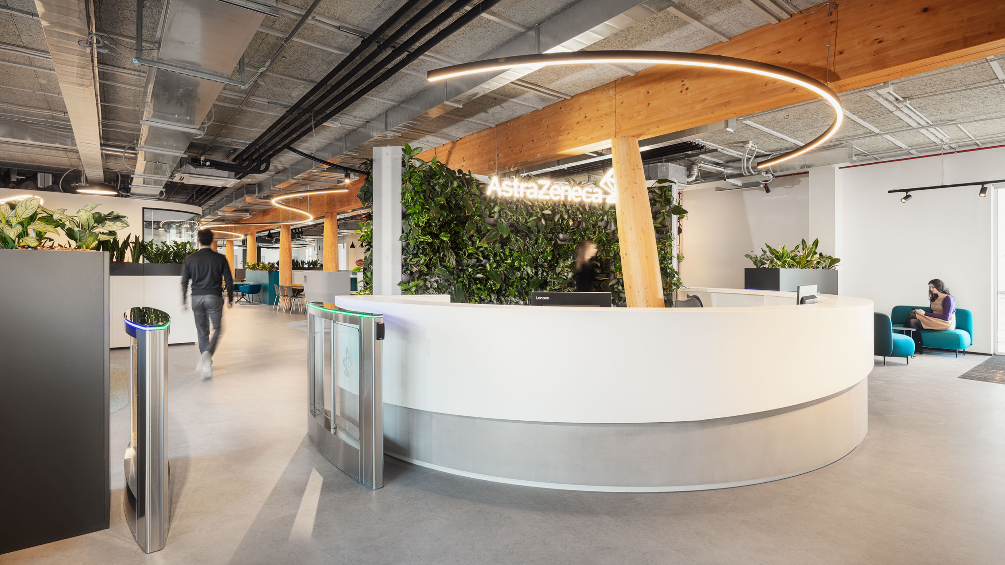
Biophilia and green design create a link with the surrounding urban context by connecting the exterior with the interior. The outdoor area becomes one with the interior through the incorporation of natural elements: a large living green wall as a backdrop to the reception, suspended plants from the ceiling, and integrated planters in the furnishings create acoustic and visual comfort, improve air quality, and create a climate of well-being and regeneration for the mind and body.
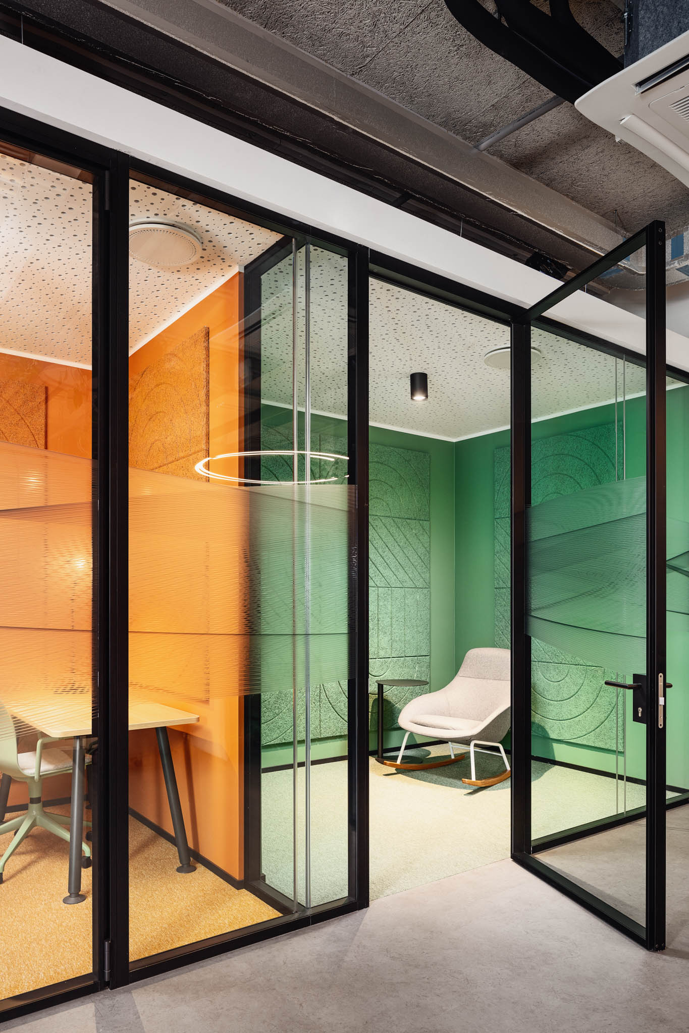
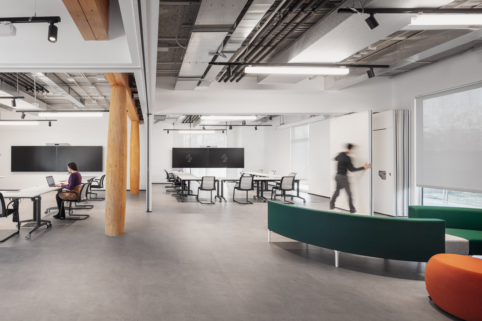
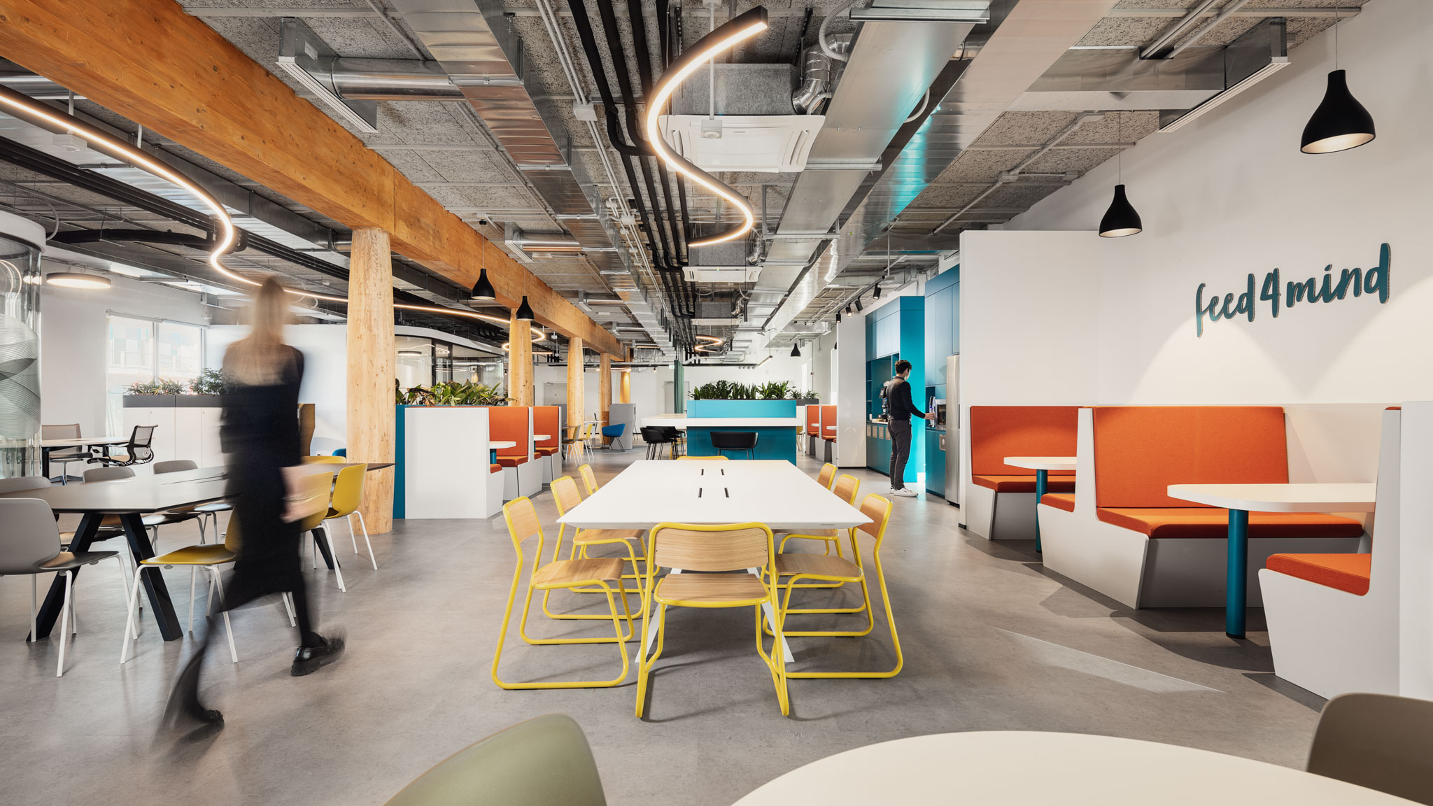
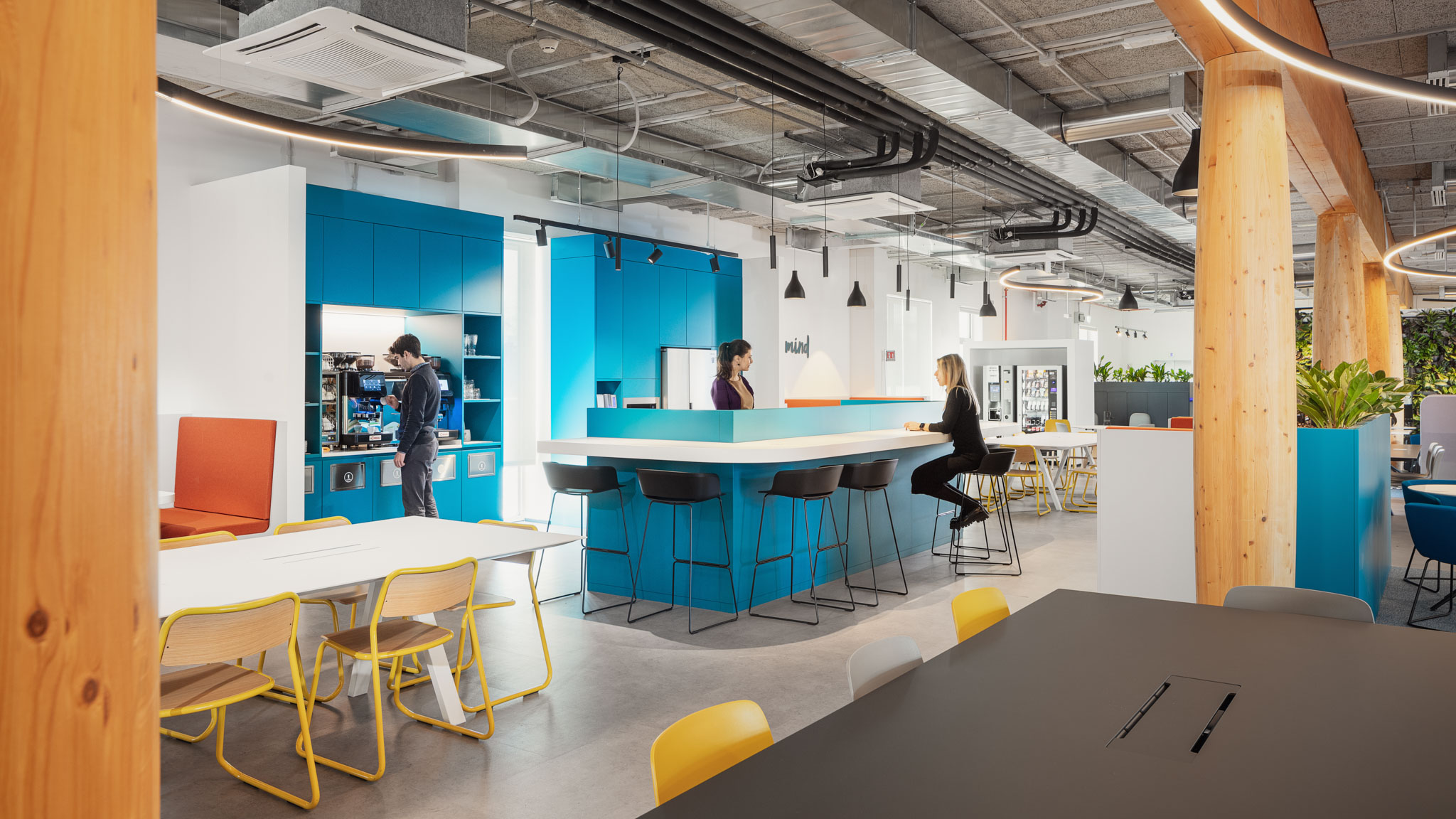
The environments are designed to showcase the brand's identity with a sustainability-oriented approach that improves the ecological quality of the spaces, promotes healthy habits, and fosters respect for the planet. Upon entering the spaces, flooded with natural light penetrating through large windows, one immediately perceives a sense of tranquility and calm, as well as conviviality, interaction, and belonging. On the ground floor, the social area serves as the vibrant heart of the entire headquarters. The entrance is presided over by a "green" reception area that, like a filter, receives and directs the flows throughout the building, leading people to a large area for socialization and spontaneous interaction. A central break area recreates the atmosphere of a real café. Various types of tables and seating allow for open and flexible use of space. Here, people can have their lunch break, have coffee with colleagues, engage in informal exchanges, organize group work, or meet with clients. Moving forward, there is a more intimate area with dedicated workspaces for specific functions and meeting rooms, culminating in a concentration area. This space is designed to evoke the atmosphere of a library, a quiet and distraction-free refuge with individual workstations and small rooms where one can disconnect and relax on comfortable rocking chairs, as if in a home study. On the other side of the building, the celebration area unfolds; a large flexible space that can be subdivided into up to four smaller rooms as needed. Foldable partitions, wheeled monitors, steps with soft velvet cushions, and lounge furnishings allow for agile use of the space, which can be easily reconfigured to host town hall-style company events, training activities, or meetings.
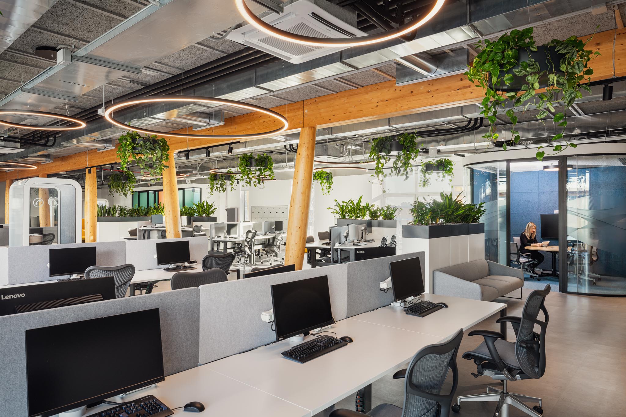
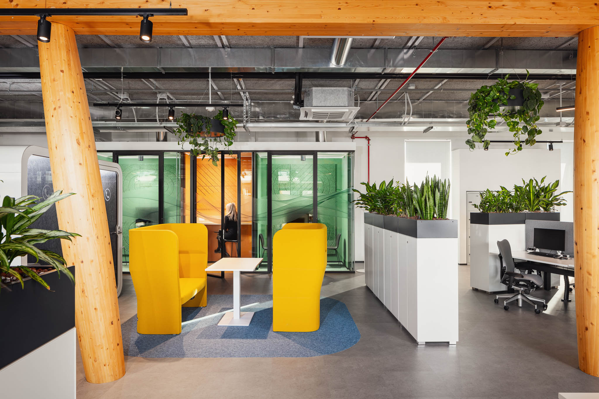
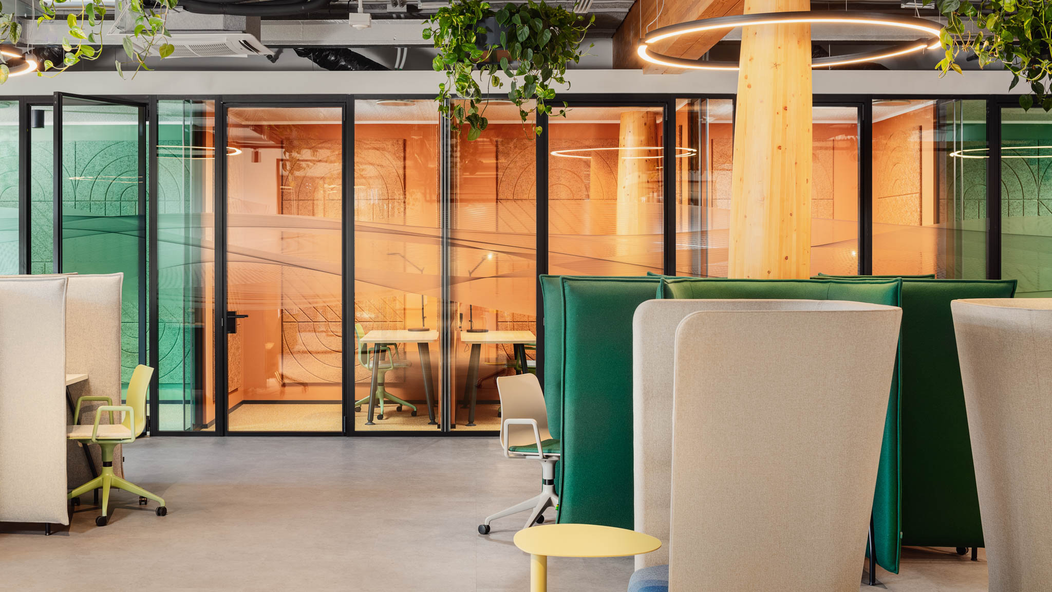
The upper floor is dedicated to operational activities and individual work. Employees are invited to choose from a variety of work areas: collaborative zones, pods for individual concentration, phone booths for calls, focus rooms, and small informal lounge areas for conversation. Traditional workstations arranged in work islands, with ergonomic seating and adjustable height desks to encourage changes in posture during working hours, are also available.
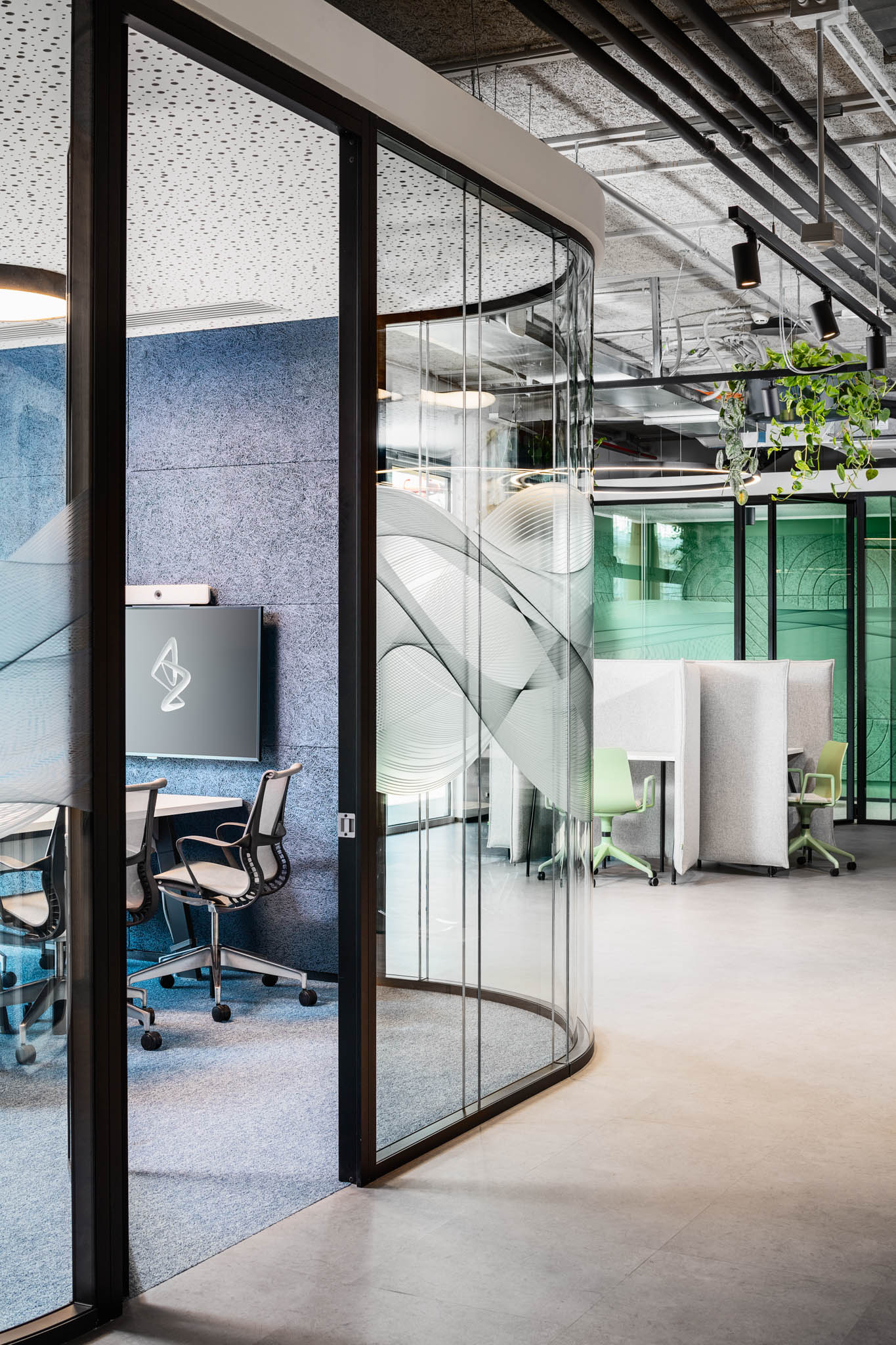
On both floors, natural and soft forms give rhythm to the space, introducing architectural elements characteristic of the concept. Meeting rooms with curved glass walls provide isolation from open spaces while maintaining visual continuity. Ceiling curtains, with their movement and lightweight structure, can be used to open and close spaces, serving as a subtle screen against noise and distractions from the open space. Illuminated elements featuring circular and sinuous lines, as well as natural greenery hanging from the ceiling, create a suspended layer that breaks the rigidity of the envelope. Each office area is equipped with small coffee points, water dispensers, and recycling points accessible to all employees, located near workstations to encourage constant hydration and responsible behaviors to reduce plastic consumption.
The use of color is studied based on the function of each area. It offers a palette of pastel tones, reminiscent of nature, in quieter zones, and accents of color in more dynamic and social areas. Green brings a sense of naturalness to the interior space and enhances attention and concentration, while blue helps people relax. Yellow and orange stimulate productivity and creativity. Finishes and materials are distinguished by being Cradle to Cradle or EPD certified, meaning they are made with virtuous production processes that minimize waste of raw materials and promote recycling, embracing the concept of circular economy for a better and positive impact on the environment, users, and people.
Photo: Davide Galli
